Financial Decks
Visualize your results with ease
4 products presenting comparison with doughnut chart
from deck
Pie and Donuts Chart Data-driven Graphics (PPT Template)
Info
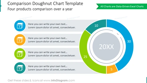
Comparison Doughnut Chart Template
Slide Content
The slide is titled "Comparison Doughnut Chart Template" and subtitled "Four products comparison over a year." It features a graphic of a doughnut chart on the right, with placeholders for percentages depicting the share of each item. Four colored icons on the left correspond to the segments of the doughnut chart, each with a placeholder text suggesting where users can write their own descriptions. Each of these explanations represents a different product or category for comparison.
Graphical Look
- The slide background is white, providing a clean and unobtrusive backdrop for the content.
- The title is displayed at the top left in bold, dark text, accompanied by a subtitle in a smaller font size.
- Four circular, flat-style icons with numbers from 1 to 4 are aligned on the left side, each with a text placeholder. Each icon has a distinct color: blue, orange, green, and teal.
- To the right, there is a large doughnut chart with segments in colors corresponding to the icons, containing numerical values and a central label "20XX."
- A ribbon-like green element in the top right corner carries the text "All Charts are Data-Driven Excel Charts."
The overall visual composition of the slide is harmonious and balanced, with a clear separation between textual information presented on the left and graphical data representation on the right.
Use Cases
- Presenting yearly sales data for multiple products in a business review meeting.
- Comparing market share of different services offered by a company in a pitch or proposal.
- Highlighting performance statistics of various teams or departments in an internal company presentation.
- Using as a visual aid during investor briefings to demonstrate growth or decline trends.


