Financial Decks
Visualize your results with ease
color full fill circls key data points infographics ppt
from deck
Infographics diagrams and symbols - flat PPT clipart
Info
Slide Content
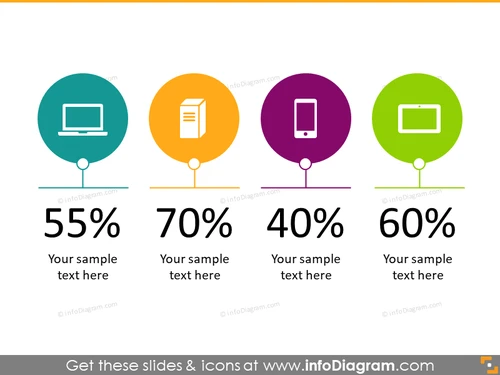
The PowerPoint slide presents a comparative analysis of four different data points. Each data point combines a numerical percentage with a placeholder for sample text to provide context, presumably explaining the significance of the percentage. The four percentages shown are 55%, 70%, 40%, and 60%, each paired with a representative icon that suggests different categories or areas of focus—such as technology platforms, content types, or user engagement levels—and are likely meant to provide a visual aid for quick recognition and understanding of each data point.
Graphical Look
- Four large, colorful circles in teal, orange, purple, and green, each containing a white icon.
- The icons, from left to right, represent a desktop computer, a document, a mobile device, and a tablet.
- Beneath each circle, there is a large, bold percentage value indicating a quantity or rate.
- Below the percentages, there is a placeholder text "Your sample text here" for each category.
- The circles are connected vertically to the percentages below by a line.
- All text is presented in a clean, sans-serif font.
- The alignment and spacing provide a balanced and symmetrical visual structure.
The overall look of the slide is clean, modern, and colorful, with the icons and percentages drawing attention. The consistent style and symmetry create an easy-to-digest visual hierarchy that emphasizes the data.
Use Cases
- Showcasing statistical data on product usage, such as the percentage of users on different types of devices.
- Representing different areas of business performance, like market share across various sectors.
- Displaying survey results or customer feedback on various service aspects.
- Visualizing progress or target achievement in sales or performance metrics.


