Financial Decks
Visualize your results with ease
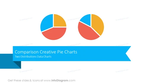
Comparison Creative Pie ChartsTwo Distributions Data Charts
from deck
Creative Percentage Shares Pie Charts (PPT Template, data-driven)
Info
Comparison Creative Pie Charts Two Distributions Data Charts
This PowerPoint slide effectively compares two different data distributions using a pair of creatively designed pie charts. It is a versatile tool for visualizing and contrasting various data sets, such as sales figures, market share percentages, or customer demographics. This slide can be used in business presentations to analyze market trends, evaluate performance metrics, and make informed business decisions.
What Does This Comparison Creative Pie Charts Two Distributions Data Charts Include?
- A bold ribbon-shaped blue title container
- Two colorful pie charts with a contrasting color scheme, each divided into four segments representing different data categories
- The overall design is clean and modern, with a focus on visual clarity and effective communication of data


