Financial Decks
Visualize your results with ease
Data driven column chart with legend
from deck
Flat Data-Driven Presentation Charts (PPT template)
Info
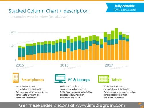
Stacked Column Chart + description
Slide Content
The slide presents a stacked column chart showing a breakdown of a website's views by device category over a three-year period—2015 to 2017. Each year is represented by a set of columns in different colors, which indicate the amount of views from smartphones, PCs & laptops, and tablets. Underneath each category, there is a placeholder for additional text, presumably to provide more specific details or analysis about that category. This slide is intended to visualize and compare data based on categorical subdivisions over time.
Graphical Look
- A large stacked column chart dominates the upper two-thirds of the slide.
- Each stacked column is composed of distinct colors representing different device categories.
- The y-axis on the left shows numeric values, presumably website view counts.
- The x-axis lists years (2015, 2016, 2017) below the corresponding set of columns.
- Below the chart, there are three colored rectangles aligning with their respective columns above; they each have an icon and title (Smartphones, PC & Laptops, Tablet).
- Next to each rectangle is a text box with placeholder text for adding descriptions.
The slide is designed with a clean, professional look featuring a cohesive color scheme. The chart is clearly the focal point, providing a visual representation of data that is easy to understand at a glance.
Use Cases
- Presenting website analytics and user behavior trends to stakeholders.
- Comparing device-based performance metrics during marketing or sales meetings.
- Demonstrating the effectiveness of a responsive website design to a client or team.
- Analyzing year-over-year growth in website traffic during annual reports or strategic reviews.


