Financial Decks
Visualize your results with ease
Statistics infographics
from deck
Data Science Big Data Analytics Icons (flat PPT clipart)
Info
STATISTICS INFOGRAPHICS
Slide Content
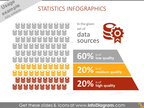
The PowerPoint slide is titled "STATISTICS INFOGRAPHICS" and contains visual representations to depict the quality of data sources. It shows a large group of iconographic figures symbolizing database stacks, with varying colors signifying different levels of data quality: 60% low quality, 20% medium quality, and 20% high quality, offering viewers an instant understanding of the proportions of each data quality category.
Graphical Look
- The slide has a white background which sets a clean stage for the elements.
- At the top left, there is a collection of database icons arranged in a grid, with colors transitioning from gray to orange to red from top to bottom, representing different data quality levels.
- To the top right, there is a single icon depicting a database with a check mark, indicating a focus on quality or verified data.
- Below the database icons, a pyramid chart in shades of gray, orange, and red correlates with the icon colors, reinforcing the data quality levels.
- Text accompanying the pyramid chart quantifies the data quality levels with percentages, making it easy to understand the data distribution.
- The design elements are flat with simple shadows for a slight 3D effect, contributing to a modern and clean aesthetic.
The slide employs a color-coding system to easily communicate the concept of data quality. The layout is balanced, with graphics on the left and explanatory text on the right, ensuring a visually appealing and easy-to-follow presentation.
Use Cases
- Illustrating the quality distribution of data sources in a business report.
- Visualizing company data management issues during internal meetings.
- Supporting discussions on data governance strategies with clear visual aids.
- Presenting market research findings where data reliability is a key factor.


