Financial Decks
Visualize your results with ease
Do’s and don’ts comparison traffic signs diagram
from deck
Road Signs Infographics (PPT Template)
Info
Do’s & Don’ts Comparison Traffic Signs Diagram
Slide Content
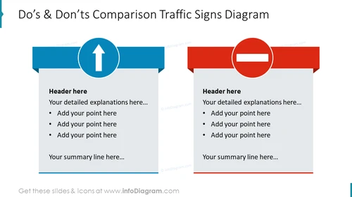
The PowerPoint slide is designed to compare "Do's" and "Don'ts" using traffic sign metaphors. On the left side, under the blue traffic sign arrow pointing upwards, there's space for a header and a list of bullet points for detailed explanations about recommended practices, along with a line for a concluding summary. On the opposite side, under the red 'no entry' sign, the same structure is provided for outlining discouraged practices.
Graphical Look
- The slide has a bold title at the top indicating the topic is a comparison of Do's and Don'ts.
- It's divided into two halves, blue on the left and red on the right, each with its own distinct traffic sign icon.
- The blue half has a round traffic sign with a white upward arrow inside a blue background circle, symbolizing the Do's.
- The red half features a red circular traffic sign with a white horizontal line, denoting the Don'ts.
- Both halves have a rectangular shape connected to the sign that provides space for text explanations with a header and bullet points.
- The slide appears clean, with ample whitespace around the texts and graphics.
The overall look of the slide is clean and professional, with a clear distinction between the do's and don'ts sections through color-coding and traffic sign symbolism, which makes it visually engaging and easy to follow.
Use Cases
- To present opposing strategies or behaviors in a business policy or guidelines meeting.
- During staff training, to highlight best practices versus common mistakes.
- In a project review session, to summarize what worked well and what to avoid in the future.
- When introducing new procedures or systems, as a visual aid to emphasize compliance and non-compliance areas.


