Financial Decks
Visualize your results with ease
Outline gauges graphics for three KPI’s
from deck
Gauge Charts for KPI Dashboards (PPT Template)
Info
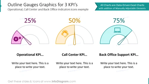
Outline Gauges Graphics for 3 KPI's
Slide Content
The slide visually represents three different Key Performance Indicators (KPIs) for Operational, Call Center, and Back Office Support using gauge graphics. Each gauge is accompanied by an icon representing its respective area: a set of gears for Operational, a headset for Call Center, and a computer for Back Office Support. Each gauge shows a percentage that indicates the level of achievement or performance, with labeled spaces below to add descriptive text about each KPI. This structured layout can succinctly convey performance metrics and areas for narrative expansion.
Graphical Look
- Three main gauge graphics, aligned horizontally, each representing a different KPI.
- The first gauge on the left is pink with gears icon, filled to 25%, and a semi-transparent grey outline behind the gauge indicates the full measurement scale.
- The middle gauge is amber with a headset icon, filled to 50%, and shows the grey outline, identical in style to the first.
- The third gauge on the right is teal with a computer icon, filled to 75%, with the consistent grey outline.
- Each gauge has a bold percentage number stating "25%", "50%", and "75%" respectively, showcased in the center of the gauge.
- There are header labels below each gauge to specify the KPI it represents: "Operational KPI...", "Call Center KPI...", and "Back Office Support KPI...".
- A block of placeholder text positioned under each header offers a space for additional input; presented in a serif font.
- On the right, there is a ribbon banner in teal that states "All Charts are Data-Driven Excel Charts with addition of Manually Adjustable Elements."
The slide has a professional and clean design with a balanced mix of text, icons, and data visualization that caters to a business-oriented audience. The use of color-coding and icons provides a quick visual reference to distinguish between different metrics.
Use Cases
- To present performance metrics during a business strategy meeting, highlighting areas that need attention or improvement.
- In a progress report to stakeholders showing key areas of operational effectiveness, customer service efficiency, or support service capability.
- For internal team meetings to discuss targets and current standings, aiding in setting goals or benchmarks.
- Incorporated into dashboards for project management or departmental performance reviews, visually tracking progress over time.


