Financial Decks
Visualize your results with ease
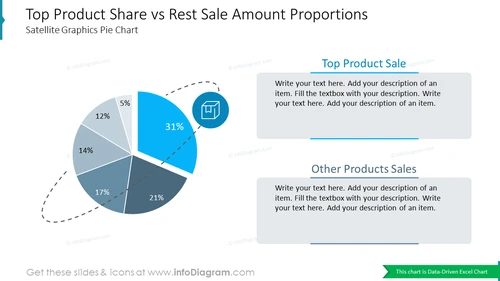
Top Product Share vs Rest Sale Amount ProportionsSatellite Graphics Pie Chart
from deck
Creative Percentage Shares Pie Charts (PPT Template, data-driven)
Info
Top Product Share vs Rest Sale Amount Proportions Satellite Graphics Pie Chart
This PowerPoint slide template provides a visually compelling representation of the sales performance of a company's top product compared to the rest of its product portfolio. The slide effectively utilizes a satellite graphics pie chart to showcase the dominance of the top product. This infographic slide can be incorporated into business presentations to highlight the significance of a particular product in driving overall sales revenue.
What Does This Top Product Share vs Rest Sale Amount Proportions Satellite Graphics Pie Chart Include?
- A vibrant and eye-catching satellite graphics Excel-driven pie chart, divided into two main sections: Top Product Sale and Other Products Sales
- The Top Product Sale section is further divided into five segments, each representing a different percentage of total sales
- Two text boxes positioned on either side of the pie chart, providing space for additional details or explanations regarding the sales figures
- An outline icon of a product, box, or offer


