Financial Decks
Visualize your results with ease
Triple gauges comparison dashboard design
from deck
Gauge Charts for KPI Dashboards (PPT Template)
Info
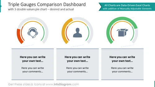
Triple Gauges Comparison Dashboard
Slide Content
The slide presents a "Triple Gauges Comparison Dashboard" with three semi-circular gauges representing a comparison between desired and actual values. Each gauge has two segments indicating progress or achievement levels. The gauges are accompanied with text boxes below where one can input relevant commentary or descriptions. These gauges are useful for visualizing performance metrics, goal achievements, or other measurable outcomes. The label indicates that the charts are data-driven from Excel and can be manually adjusted as needed.
Graphical Look
- The slide background is white, providing a neutral canvas for the content.
- Three semi-circular gauge charts are prominently displayed in the upper half of the slide.
- Each gauge consists of a thick main arc that likely represents the actual value and a thin overlapping arc signifying the desired value or target.
- The first gauge on the left is colored in shades of red and grey, the second in the middle has shades of green and grey, and the third on the right shows shades of yellow and grey.
- Centered within each gauge is a light grey icon; from left to right: a pair of headphones, a user silhouette, and an open box.
- Below each gauge is a corresponding text box with a grey background, containing placeholder text with instructions for customization.
- The text boxes each have an additional area below them designated for further comments.
- The top right corner features a green ribbon-shaped banner with white text indicating the nature of the charts.
The overall look of the slide is professional and clean, with a focus on the visual gauges that are designed for easy interpretation of data. The use of color not only differentiates between the gauges but also adds a visual hierarchy to the information being presented.
Use Cases
- Presenting key performance indicators (KPIs) in a business dashboard during company meetings.
- Visualizing sales targets versus actual sales in a quarterly business review presentation.
- Displaying customer satisfaction scores in a customer service or product development update.
- Utilizing in project management to showcase project milestones and current progress against planned timelines.


