Financial Decks
Visualize your results with ease
Two Column Dashboard Slide Layout
from deck
Dashboard Layouts for Executive Data Report Presentation (PPT Template)
Info
Two Column Dashboard Slide Layout
Slide Content
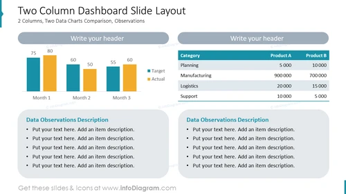
The slide titled "Two Column Dashboard Slide Layout" presents a comparison between two data charts over three months for target versus actual figures, accompanied by two sections for data observations description. These sections allow the presenter to include detailed explanations or insights about the data presented. The topic implies a focus on performance measurement, with the ability to customize the header and add specific observations relevant to the data.
Graphical Look
- The slide is divided into two main columns, each with a distinctive background color, light blue on the left and white on the right.
- On the left side, there is a bar chart comparing 'Target' (in dark blue) and 'Actual' (in orange) values across 'Month 1', 'Month 2', and 'Month 3'.
- On the right side there is a table with 'Category' in one column and 'Product A' and 'Product B' in the other two columns, filled with numerical values.
- Both the bar chart and the table have title placeholders above them, which currently prompt to 'Write your header'.
- Below each graph or table, there's a rounded rectangle with the title 'Data Observations Description' and bulleted placeholders for text.
The overall look of the slide is clean and corporate, with a neutral color scheme that allows for clear presentation of data. The use of icons is minimal, with more emphasis on the graphs, charts, and text sections.
Use Cases
- Presenting monthly business performance metrics comparing targets versus actual results.
- Showcasing product comparisons or sales figures in a business meeting to highlight strengths and areas for improvement.
- Offering detailed analyses of marketing or operational data during corporate presentations.
- Utilizing in a financial report to provide investors with visual comparisons of projected and real financial figures.


