Financial Decks
Visualize your results with ease
Compason table template
from deck
Creative Company Presentation Deck (Scribble PPTX Template)
Info
Comparison Table
Slide Content
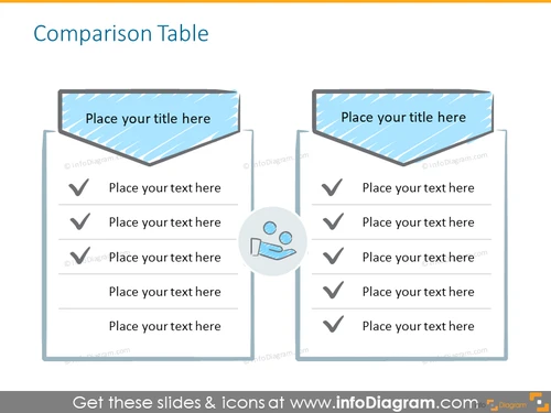
The slide is titled 'Comparison Table' and presents a two-column comparison layout that is often used to evaluate two different objects, ideas, or plans side-by-side. Each column has a space for a title and several rows for descriptive text with a preceding checkmark symbol, indicating positive features or alignment with certain criteria. The design implies an ability to delineate clear distinctions or similarities between the two subjects being compared.
Graphical Look
- Two rectangular shapes with a slightly skewed parallelogram shape at the top serve as headers for the columns. Each header has a textured fill and a placeholder for a title.
- Below the headers, there are five rows for text, each row featuring a checkmark bullet point indicating a list item or a feature.
- The graphical elements are colored with shades of blue and grey, suggesting a professional and neutral tone.
- An informational icon (a magnifying glass and a wrench) centrally placed at the bottom of the slide indicates a focus on analysis or customization.
- The overall layout is clean, symmetrical, and utilizes a minimalist design aesthetic with a professional look.
The slide's design is straightforward and utilitarian, making the content easy to read and compare. The color scheme and graphical elements are chosen to not distract from the key comparative information being presented.
Use Cases
- Presenting product comparisons, highlighting the features and benefits of each to aid in decision-making.
- Comparing two strategies or plans to show their respective advantages and disadvantages in a business setting.
- Evaluating competitor offerings against each other or against one's own product/service.
- Summarizing research findings or data points where a side-by-side comparison makes the information clearer and more digestible for the audience.


