Your graphics add a nice touch to my presentations and I recently used them for one of my all-hands meetings. Your toolbox adds professionalism to my slides. Instead of using standard clipart.
Claude Jones, Director of Engineer, @Walmartlabs, USA
Your graphics add a nice touch to my presentations and I recently used them for one of my all-hands meetings. Your toolbox adds professionalism to my slides. Instead of using standard clipart.
Claude Jones, Director of Engineer, @Walmartlabs, USA
I needed a fresh look at some of my slides. I've tried to find a way to create a paintbrush effect, to underline, accentuate, add some color and the handwritten markers were just the things. Very easy to use, easy to size, change the color. It was an affordable, perfect solution and I'm happy to recommend it.
Anonymous, US
The crisp, clean look of the graphics, and the fact that it allowed me to easily edit and change the colors to match the template was my main reason for purchasing them.
Brandie Jenkins, E-learning Developer, USA
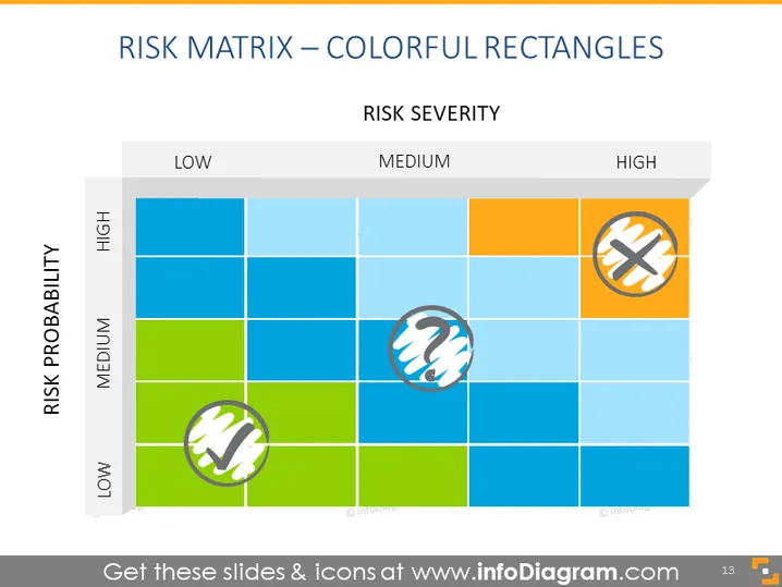
The slide presents a risk matrix with a grid that categorizes risk severity against risk probability, each on a scale from low to high. It uses color-coded rectangles to visually differentiate between the levels of severity and probability. The intersections where the icons are placed imply the priority or significance of various risks - the icon placed in the high probability and high severity section indicates a critical risk that may require immediate attention, while the other icons suggest moderate risks.
The slide has a clean and professional design, with a distinct color scheme that intuitively communicates the levels of risk severity and probability. The visual elements such as colored rectangles and symbols are effectively used to convey information at a glance.


