Your graphics add a nice touch to my presentations and I recently used them for one of my all-hands meetings. Your toolbox adds professionalism to my slides. Instead of using standard clipart.
Claude Jones, Director of Engineer, @Walmartlabs, USA
Your graphics add a nice touch to my presentations and I recently used them for one of my all-hands meetings. Your toolbox adds professionalism to my slides. Instead of using standard clipart.
Claude Jones, Director of Engineer, @Walmartlabs, USA
I needed a fresh look at some of my slides. I've tried to find a way to create a paintbrush effect, to underline, accentuate, add some color and the handwritten markers were just the things. Very easy to use, easy to size, change the color. It was an affordable, perfect solution and I'm happy to recommend it.
Anonymous, US
The crisp, clean look of the graphics, and the fact that it allowed me to easily edit and change the colors to match the template was my main reason for purchasing them.
Brandie Jenkins, E-learning Developer, USA
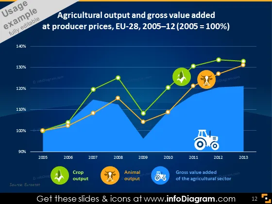
The slide illustrates the trend of agricultural output and gross value added at producer prices in the EU-28 from 2005 to 2013. The presentation shows that there is a steady increase in the producer price index over this timeframe, with specific indicators like crop output, animal output, and the gross value of the agricultural sector mapped on the graph. Crop output and animal output refer to the production of plant and livestock products respectively, while gross value added signifies the net output of the sector after subtracting the inputs.
The overall look of the slide is modern and visually engaging, with a clear distinction between different sets of data through color coding and icons. The slide effectively conveys complex information in an easy-to-digest graphical format.




