Financial Decks
Visualize your results with ease
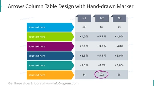
Arrows column table design with hand-drawn marker
from deck
Modern Flat Diagrams - Ultimate Bundle for Visual Presentations (PPT graphics)
Info
Arrows Column Table Design with Hand-drawn Marker
Slide Content
The slide conveys information through a unique design that employs arrow-shaped rows that indicate progression. There are three main columns titled N1, N2, and N3. In each column, a series of values are listed, such as 64, 85, 73, alongside percentage figures such as +4.0%, +5.7%, etc., reflecting growth or decline rates. Each arrow contains placeholder text for further elaboration. The arrows appear to denote individual data entries or categories that can be explained by the presenter. At the bottom, there is a sequence of three numerical figures highlighted, with one (102) being circled for emphasis.
Graphical Look
- The slide has a white background with a set of seven colorful arrow-shaped bars, each a different color, indicating rows in a table.
- Above the arrows are three rectangular shapes with a 3D effect, representing the column headers N1, N2, and N3.
- Each rectangular column header is connected to a corresponding set of numerical values and percentages, presented in a lighter shade of grey, creating the appearance of columns.
- The arrow-shaped bars seem to represent a timeline or sequential elements with space for descriptive text.
- The bottom part of the slide contains three individual numerical values, '84,' '102,' and '98,' with '102' encircled and highlighted by a purple, hand-drawn oval.
- The overall visual composition is modern and dynamic, employing colors to differentiate data rows and a mix of numerical and percentage data to exhibit trends or comparisons.
The overall slide aesthetics are professional with a creative touch, utilizing a combination of sharp graphics, bold colors, and hand-drawn elements to present information in an engaging way.
Use Cases
- To showcase sequential steps or stages in a process, with each arrow representing a different phase and the associated data.
- In financial presentations to explain quarterly results, where each column corresponds to a different quarter and arrows indicate performance trends.
- To represent key performance indicators (KPIs) across various departments or product lines, with the arrows denoting different categories.
- In marketing strategy meetings, to outline campaign results over multiple periods, with the focus on specific metrics such as customer engagement or sales figures.


