Your graphics add a nice touch to my presentations and I recently used them for one of my all-hands meetings. Your toolbox adds professionalism to my slides. Instead of using standard clipart.
Claude Jones, Director of Engineer, @Walmartlabs, USA
Your graphics add a nice touch to my presentations and I recently used them for one of my all-hands meetings. Your toolbox adds professionalism to my slides. Instead of using standard clipart.
Claude Jones, Director of Engineer, @Walmartlabs, USA
I needed a fresh look at some of my slides. I've tried to find a way to create a paintbrush effect, to underline, accentuate, add some color and the handwritten markers were just the things. Very easy to use, easy to size, change the color. It was an affordable, perfect solution and I'm happy to recommend it.
Anonymous, US
The crisp, clean look of the graphics, and the fact that it allowed me to easily edit and change the colors to match the template was my main reason for purchasing them.
Brandie Jenkins, E-learning Developer, USA
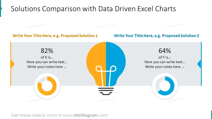
The PowerPoint slide presents a comparative analysis of two solutions, each complemented with a data-driven Excel chart. The left side displays "Proposed Solution 1" with an 82% metric, accompanied by space for additional text and notes. The right side introduces "Proposed Solution 2" with a 64% metric, also providing areas to elaborate on the solution. Each section uses a circular chart to visually underscore the percentage data, indicating varying degrees of completion or success.
The slide uses a clean and professional design with contrasting color schemes to differentiate between the two solutions. The central light bulb icon serves as both a thematic element related to innovation and a visual separator of content.


