Your graphics add a nice touch to my presentations and I recently used them for one of my all-hands meetings. Your toolbox adds professionalism to my slides. Instead of using standard clipart.
Claude Jones, Director of Engineer, @Walmartlabs, USA
Your graphics add a nice touch to my presentations and I recently used them for one of my all-hands meetings. Your toolbox adds professionalism to my slides. Instead of using standard clipart.
Claude Jones, Director of Engineer, @Walmartlabs, USA
I needed a fresh look at some of my slides. I've tried to find a way to create a paintbrush effect, to underline, accentuate, add some color and the handwritten markers were just the things. Very easy to use, easy to size, change the color. It was an affordable, perfect solution and I'm happy to recommend it.
Anonymous, US
The crisp, clean look of the graphics, and the fact that it allowed me to easily edit and change the colors to match the template was my main reason for purchasing them.
Brandie Jenkins, E-learning Developer, USA
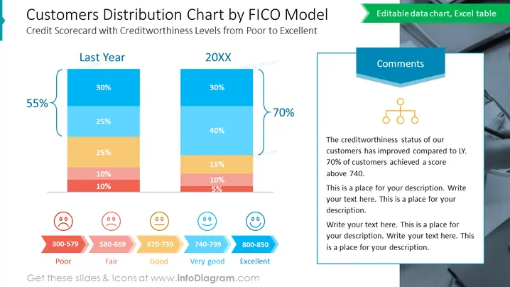
The slide compares customer creditworthiness distribution between last year and the current year using a vertical stacked bar chart, with each segment color-coded by FICO score range. "Last Year" shows a 55% negative change in customer distribution, with the majority scoring in the "Poor" to "Fair" range. Conversely, "20XX" displays a positive 70% shift towards the "Very good" and "Excellent" categories, indicating an improvement in customer credit scores.
The slide features a contemporary design ## Customers Distribution Chart by FICO Model
The slide presents a "Customers Distribution Chart by FICO Model," analyzing changes in creditworthiness from "Last Year" to "20XX." Two stacked bar charts depict the percentage of customers falling within different FICO score ranges: "Poor," "Fair," "Good," "Very Good," and "Excellent." The left bar represents last year with a significant portion in the lower score ranges, while the right bar indicates an improvement in the current year with 70% of customers having scores above 740.
The title is prominently displayed in large, dark blue text, highlighted with a lighter blue color.
Two stacked bar charts comparisively represent data for "Last Year" and "20XX," with contrasting colors for each FICO score category.
On the left, a large teal-colored callout with "55%" references a decrease, contrasted by a "70%" callout on the right suggesting an increase.
A separate text box for comments is located on the right, with a three-tier hierarchy flowchart icon above it.
Each FICO score range is assigned a distinct color: red for "Poor," orange for "Fair," light orange for "Good," light blue for "Very Good," and dark blue for "Excellent."
Emoticon faces corresponding to the FICO score sentiment are placed at the bottom of the chart, with colors matching the score categories.
The different scores are neatly labeled below the emoticons with a clear color-coded system against a subtle gray backdrop.
The slide is visually balanced, with bold colors for chart elements and a clean, professional layout. Icons and emoticons add a layer of visual engagement to the data presentation.
Ideal for financial presentations to illustrate changes in customer credit scores over time.
Useful for credit and risk assessment meetings to visually communicate the credit profile of a customer base.
Can be employed ## Customers Distribution Chart by FICO Model
The slide titled "Customers Distribution Chart by FICO Model" visually compares customer credit score distributions across two periods, marked as "Last Year" and "20XX". The data is categorized by credit score ranges: Poor (300-579), Fair (580-669), Good (670-739), Very Good (740-799), and Excellent (800-850). There's a noted improvement from last year to the current year, with a shift towards a higher percentage of customers having Very Good and Excellent credit scores. A comment box suggests an overall improvement in creditworthiness, noting that 70% of customers now have a score above 740.
The slide has a crisp, professional appearance, with contrasting colors that draw attention to the key elements. It balances the use of bold colors and simple icons to convey complex data in a digestible format.
This slide depicts a bar graph titled "Customers Distribution Chart by FICO Model," contrasting credit scorecard levels from "Poor" to "Excellent." The graph compares the distribution changes between 'Last Year' and '20XX,' with emphasis on customer creditworthiness improvements. Each FICO score range has a corresponding color and percentage, where 'Poor' indicates high risk, 'Fair' is below average risk, 'Good' signifies average risk, 'Very Good' demonstrates above-average credit quality, and 'Excellent' represents the highest credit quality with the lowest risk.
The overall visual theme is clean and corporate, with a clear color-coding system that makes the data easily understandable at a glance. The use of expressive icons adds a user-friendly touch to the otherwise formal financial data.


