Your graphics add a nice touch to my presentations and I recently used them for one of my all-hands meetings. Your toolbox adds professionalism to my slides. Instead of using standard clipart.
Claude Jones, Director of Engineer, @Walmartlabs, USA
Your graphics add a nice touch to my presentations and I recently used them for one of my all-hands meetings. Your toolbox adds professionalism to my slides. Instead of using standard clipart.
Claude Jones, Director of Engineer, @Walmartlabs, USA
I needed a fresh look at some of my slides. I've tried to find a way to create a paintbrush effect, to underline, accentuate, add some color and the handwritten markers were just the things. Very easy to use, easy to size, change the color. It was an affordable, perfect solution and I'm happy to recommend it.
Anonymous, US
The crisp, clean look of the graphics, and the fact that it allowed me to easily edit and change the colors to match the template was my main reason for purchasing them.
Brandie Jenkins, E-learning Developer, USA
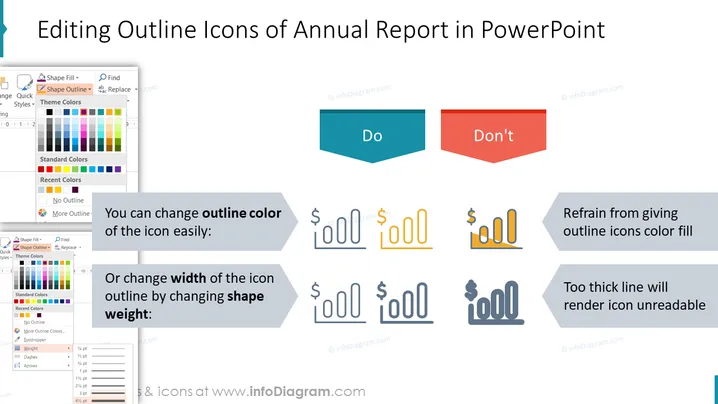
The slide provides tips on editing outline icons in PowerPoint specifically for annual reports. It emphasizes the ease of changing the color of an icon's outline, suggesting this as something to do. In contrast, it advises against filling the outline icons with color and warns that using too thick a line will make the icon unreadable. These best practices can help maintain clarity and effectiveness in visual communication within reports.
The overall look of the slide is clean and instructional with visually coordinated elements that clearly convey the recommended practices and mistakes to avoid when editing icons.


