Financial Decks
Visualize your results with ease
Key Financial and Customer Performance Indicators Dashboard
from deck
Dashboard Layouts for Executive Data Report Presentation (PPT Template)
Info
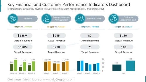
Key Financial and Customer Performance Indicators Dashboard
Slide Content
The slide shows a dashboard for analyzing key performance indicators (KPIs) related to finances and customer metrics. It is divided into four categories: Revenue, Average Revenue Per Customer, New Customers, and Customer Acquisition Cost. Each category includes a 'Target vs. Actual' comparison. Revenue shows an actual of $188M against a $120M target. Average Revenue Per Customer presents $245 actual vs. a $220 target. The New Customers' segment details 80 actual new customers compared to a target of 75. Lastly, Customer Acquisition Cost shows $130 actual vs. an $80 target. Each category comes with a three-month trend chart, displaying monthly performance in relation to targets.
Graphical Look
- The slide features a dark blue background with four white content boxes aligned horizontally.
- Each content box contains a unique icon at the top, indicating the respective category of the performance metric.
- The icons are encircled by a lighter blue background, harmonizing with the overarching color scheme of the slide.
- Below each icon, there is a gray capsule shape with the category label in white text.
- The 'Target vs. Actual' performance is prominently displayed in large bold font, with the actual values highlighted in darker text for emphasis.
- Below each 'Target vs. Actual' comparison, there are bar charts showing three columns representing three months of data.
- The bar charts have a distinct color for each category—green for Revenue, yellow for Average Revenue Per Customer, blue for New Customers, and teal for Customer Acquisition Cost.
- Horizontal lines separate the title area from the content area and individual metrics for clarity and visual structure.
The slide is visually balanced with a clean and professional design, utilizing a consistent color palette and clear typography to convey complex data effectively. It is designed to provide a quick, at-a-glance comparison of company performance metrics against established targets.
Use Cases
- To present quarterly financial and customer acquisition results in corporate meetings.
- For tracking company performance against set goals in internal strategy sessions.
- As a visual aid in investor relations presentations to illustrate financial health and customer growth.
- For use in management and sales team meetings to review and discuss progress towards KPIs and necessary strategical adjustments.


