Your graphics add a nice touch to my presentations and I recently used them for one of my all-hands meetings. Your toolbox adds professionalism to my slides. Instead of using standard clipart.
Claude Jones, Director of Engineer, @Walmartlabs, USA
Your graphics add a nice touch to my presentations and I recently used them for one of my all-hands meetings. Your toolbox adds professionalism to my slides. Instead of using standard clipart.
Claude Jones, Director of Engineer, @Walmartlabs, USA
I needed a fresh look at some of my slides. I've tried to find a way to create a paintbrush effect, to underline, accentuate, add some color and the handwritten markers were just the things. Very easy to use, easy to size, change the color. It was an affordable, perfect solution and I'm happy to recommend it.
Anonymous, US
The crisp, clean look of the graphics, and the fact that it allowed me to easily edit and change the colors to match the template was my main reason for purchasing them.
Brandie Jenkins, E-learning Developer, USA
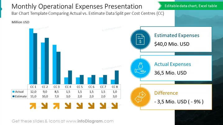
The slide displays a comparison of estimated and actual monthly operational expenses across eight cost centers. Each cost center has a pair of bars representing the actual expense and the estimated budget in millions of USD, with the actual figures generally falling below estimates. This data suggests effective cost management. There are also summaries of the total estimated expenses, the total actual expenses, and the resultant difference highlighted as a percentage, indicating a favorable variance of 9% under the estimated budget.
The slide is well-structured with a clear visual hierarchy, using contrasting colors and icons to effectively communicate financial data. The overall look is polished and professional, with a strong emphasis on graphical representation of data.


