Reviews
Description
Responsive Web Design
Slide Content
The slide titled "Responsive web design" explains the concept of delivering a website in different versions optimized for various devices. It highlights three types of device adaptation:
- Simple mobile version: Limited content and functionality for small resolution touchscreens.
- Medium resolution version: Offering limited content but full functionality.
- Full HD desktop version: Provides full content with full functionality for high-resolution screens.
Each version is designed to cater to the specific capabilities and specifications of the end user's device.
Graphical Look
- The title "Responsive web design" is prominent at the top of the slide in large, bold text.
- A central vertical line connects three horizontal bars, each leading to a different representation of a web interface.
- The left side of the slide details levels of device adaptation with labeled circles: "Simple mobile version" and "Full HD desktop version."
- Accompanying text explains the adaptation, situated next to each circle.
- On the right side, graphical icons represent different devices: a smartphone, a tablet, and a desktop monitor.
- Each device icon is linked to a description: "Limited content with limited functionality," "Limited content with full functionality," and "Full content with full functionality."
- Colors are used to visually distinguish the three levels: blue for the mobile version, green for medium resolution, and orange for the full HD version.
The overall look of the slide is clean and modern, with a clear visual hierarchy that guides the viewer through the content. The color-coded elements and device icons effectively communicate the concept of responsive web design.
Use Cases
- Presenting the principles of responsive design in a web development or design workshop.
- Explaining website optimization for various devices to clients in a web design pitch.
- Demonstrating the progressive enhancement strategy in a UX/UI design meeting.
- Discussing mobile-first strategies in a marketing presentation focused on reaching mobile users.
How to Edit
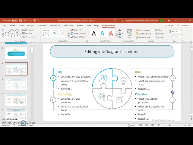
How to edit text & colors

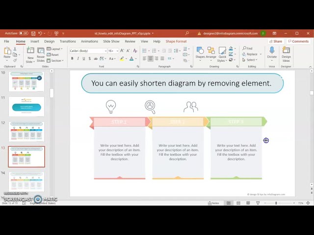
How to expand / shorten diagram

How to Replace Icons in infoDiagram PPT


