Reviews
Sus gráficos añaden un toque agradable a mis presentaciones y recientemente los usé para una de mis reuniones generales. Su conjunto de herramientas añade profesionalismo a mis diapositivas. En lugar de usar imágenes prediseñadas estándar.
Necesitaba un aspecto fresco para algunas de mis diapositivas. Había intentado encontrar una forma de crear un efecto de pincel, de subrayar, acentuar, añadir algo de color y los marcadores escritos a mano fueron justo lo que necesitaba. Muy fácil de usar, fácil de ajustar el tamaño, cambiar el color. Fue una solución asequible y perfecta, y estoy feliz de recomendarla.
El aspecto nítido y limpio de los gráficos, y el hecho de que me permitiera editar y cambiar fácilmente los colores para que coincidieran con la plantilla fue mi principal razón para comprarlos.
Description
Smartphone portrait and landscape orientation
Slide Content
The PowerPoint slide presents the concept of smartphone orientation, specifically highlighting the two common modes: portrait and landscape. The portrait orientation is characterized by the height of the display being greater than its width, suitable for scrolling through feeds or reading. The landscape orientation, conversely, has a wider aspect ratio, which is optimal for watching videos and playing games, providing a broader visual experience.
Graphical Look
- The slide has a clean and modern design with a predominantly blue gradient background that transitions from a darker shade at the top to a lighter shade at the bottom.
- Centered at the top is the slide title in white, capitalized font.
- Two highly-detailed, three-dimensional smartphone illustrations dominate the slide, placed side by side in the center.
- The smartphone on the left is in portrait orientation, standing tall with its screen displaying shades of blue to represent content.
- The smartphone on the right is in landscape orientation, laying horizontally with a similar content representation on its screen.
- Both smartphones have a black bezel, and the one in portrait mode includes a home button at the bottom.
- The URL placeholder 'http://my.domain.com' is shown on the phones' screens, indicating a generic web address.
- There is a slight shadow under each smartphone, giving a sense of depth and making them stand out from the blue background.
The overall look of the slide is sleek and professional, employing a minimalistic style with a focus on the visual comparison between the two smartphone orientations.
Use Cases
- To explain the functionality and advantages of different phone orientations during application design presentations.
- In marketing pitches to showcase how a company's product or website can adapt to different screen orientations.
- For educational purposes, to teach about responsive web design and the importance of mobile-friendly layouts.
- During technical workshops or seminars, demonstrating how software interfaces or digital content appears in various device orientations.
How to Edit
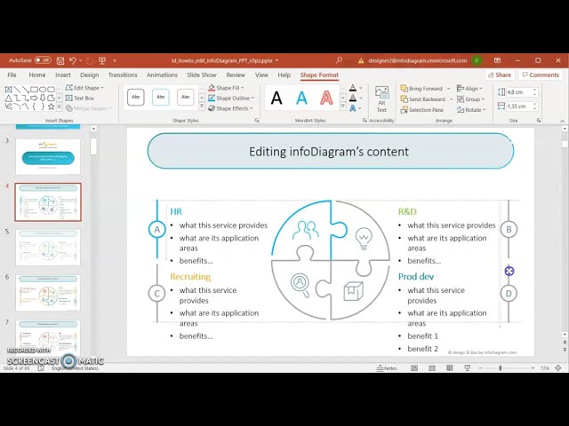
How to edit text & colors

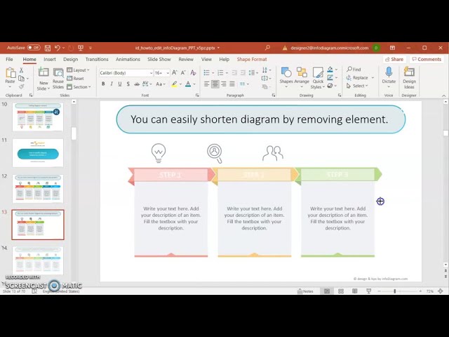
How to expand / shorten diagram

How to Replace Icons in infoDiagram PPT


