Your graphics add a nice touch to my presentations and I recently used them for one of my all-hands meetings. Your toolbox adds professionalism to my slides. Instead of using standard clipart.
Claude Jones, Director of Engineer, @Walmartlabs, USA
Your graphics add a nice touch to my presentations and I recently used them for one of my all-hands meetings. Your toolbox adds professionalism to my slides. Instead of using standard clipart.
Claude Jones, Director of Engineer, @Walmartlabs, USA
I needed a fresh look at some of my slides. I've tried to find a way to create a paintbrush effect, to underline, accentuate, add some color and the handwritten markers were just the things. Very easy to use, easy to size, change the color. It was an affordable, perfect solution and I'm happy to recommend it.
Anonymous, US
The crisp, clean look of the graphics, and the fact that it allowed me to easily edit and change the colors to match the template was my main reason for purchasing them.
Brandie Jenkins, E-learning Developer, USA
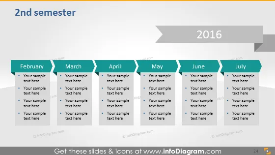
The slide presents a timeline for the "2nd semester" of the year "2016" with a monthly breakdown from "February" to "July." Each month has a dedicated box containing "Your sample text here" placeholders, suggesting a format where specific activities, tasks, or milestones might be detailed. This structured representation allows for a clear, concise visualization of a semester's plan or progress.
The overall look of the slide is clean and professional with a clear visual path leading the viewer's eye from left to right, symbolizing the progression of time. The use of alternating colors for the months provides a visual distinction that helps in navigating the timeline.


