Your graphics add a nice touch to my presentations and I recently used them for one of my all-hands meetings. Your toolbox adds professionalism to my slides. Instead of using standard clipart.
Claude Jones, Director of Engineer, @Walmartlabs, USA
Your graphics add a nice touch to my presentations and I recently used them for one of my all-hands meetings. Your toolbox adds professionalism to my slides. Instead of using standard clipart.
Claude Jones, Director of Engineer, @Walmartlabs, USA
I needed a fresh look at some of my slides. I've tried to find a way to create a paintbrush effect, to underline, accentuate, add some color and the handwritten markers were just the things. Very easy to use, easy to size, change the color. It was an affordable, perfect solution and I'm happy to recommend it.
Anonymous, US
The crisp, clean look of the graphics, and the fact that it allowed me to easily edit and change the colors to match the template was my main reason for purchasing them.
Brandie Jenkins, E-learning Developer, USA
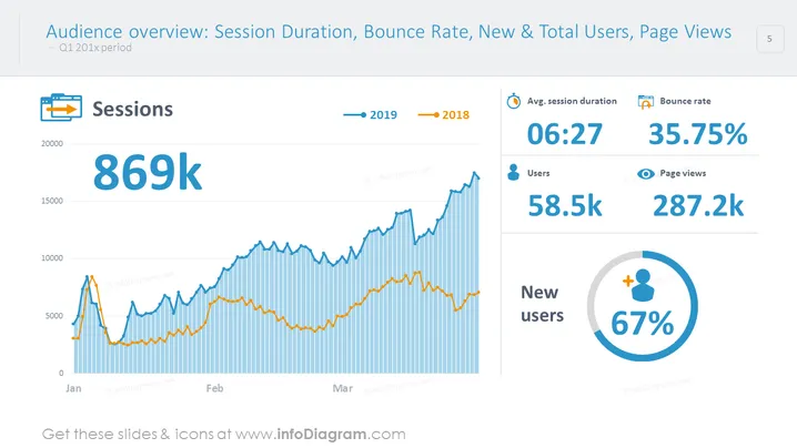
##Audience Overview Shown With Colorful Chart and Values Template
This is an editable PowerPoint dashboard for multiple user's performance metrics: avg. session duration, bounce rate, users, page views, new users, and the number of sessions over specific years. It allows fast comparison and is a fundamental step before setting any goals for the future.
##What Does This Audience Overview Shown With Colorful Chart and Values Template Include?
This Audience Overview Shown With Colorful Chart and Values Template is a part of our Web Analytics Report Charts PPT Template.


